Bright Winter
Cool, clear and saturated: the brightest of the cool palettes.
Bright Winter is cool with the contrast and clarity turned up: bright eyes, dark hair, skin that can carry vivid colour. Clear, cool, saturated colours suit you; muted or warm tones flatten that brightness. It borders Bright Spring, so coolness is the tiebreaker.
Go for cobalt, emerald, clear red and bright teal against obsidian black and icy white, with charcoal and navy holding the base. The mistake is muting anything down: Bright Winter is one of the few seasons that genuinely needs the colour loud.
How to wear it
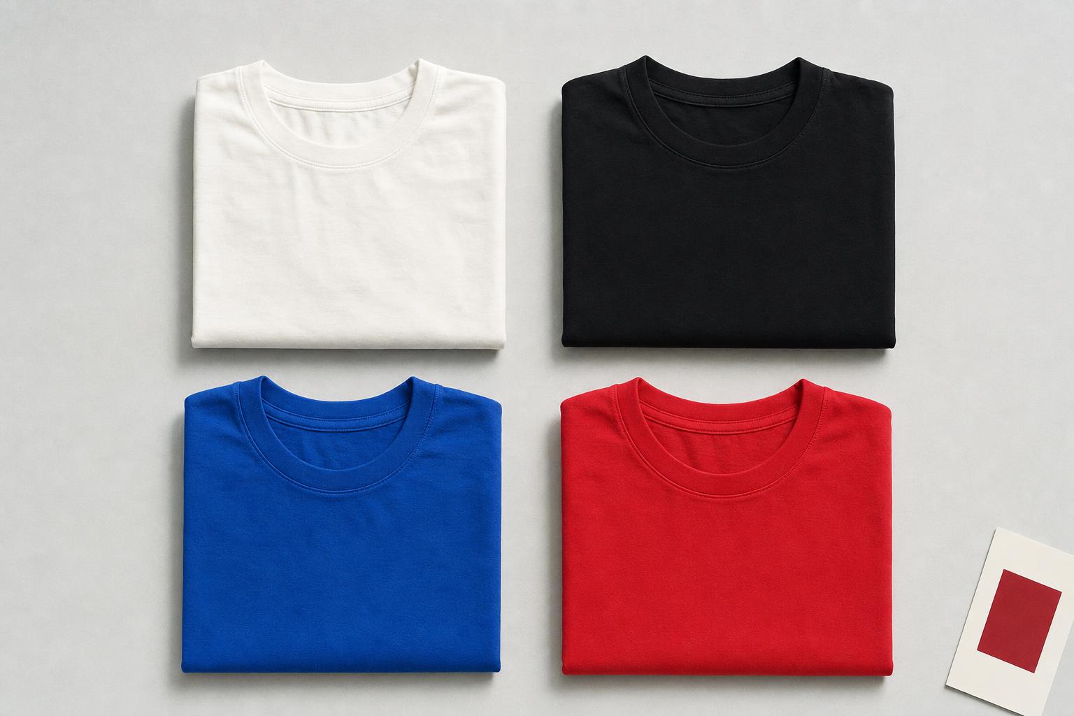
Porcelain and Obsidian set the frame, then the colour goes loud: True Blue, Emerald or Clear Red at full saturation, one per outfit, straight against black or white. Icy Blue is the quiet option that still reads clear.
Keep every piece clean-edged and saturated: stark white tees rather than off-white, the darkest indigo or black denim, charcoal when you need a softer anchor. This is one of the few palettes where a genuinely bright tee under a black jacket is the correct answer rather than the risky one.
What to skip
Anything muted, warm or faded: olive, rust, camel, dusty pastels, washed colour of any kind. Softening the palette is the mistake; a Bright Winter in beige disappears. If it would look at home on an autumn moodboard, it is not yours.
Tees for Bright Winter
14 solid-color basics matched to this palette by color. Pick a colour to narrow it, or take the whole season. Links go out to the brand; we may earn a commission.
Affiliate links. Garamond Goods may earn a commission on purchases. Prices & availability are set by each brand.
Close calls
Bright Winter borders True Winter, one step less saturated, and Bright Spring, the same loudness gone warm. If ivory and camel beat porcelain and black near your face, you are likely the spring.